Thursday - Day 4
Thursday (24 papers!)
- VIS Full Papers: ML for VIS
- VIS Full Papers: Digital Humanities, e-Commerce, and Engineering - Enrico Bertini
- VIS Full Papers: Storytelling
- VIS Full Papers: Provenance and Guidance - Alvitta Ottley
Highlights
- Morning P1
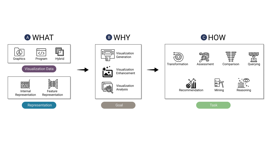
- 3 taxonomies post survey framework for AI <> Viz intersections (evaluation, generation, NL, copiloting)
- 3rd paper taxonomy probably most tied to immediate future work, could be paper group idea (find top impacting papers to prioritize?)
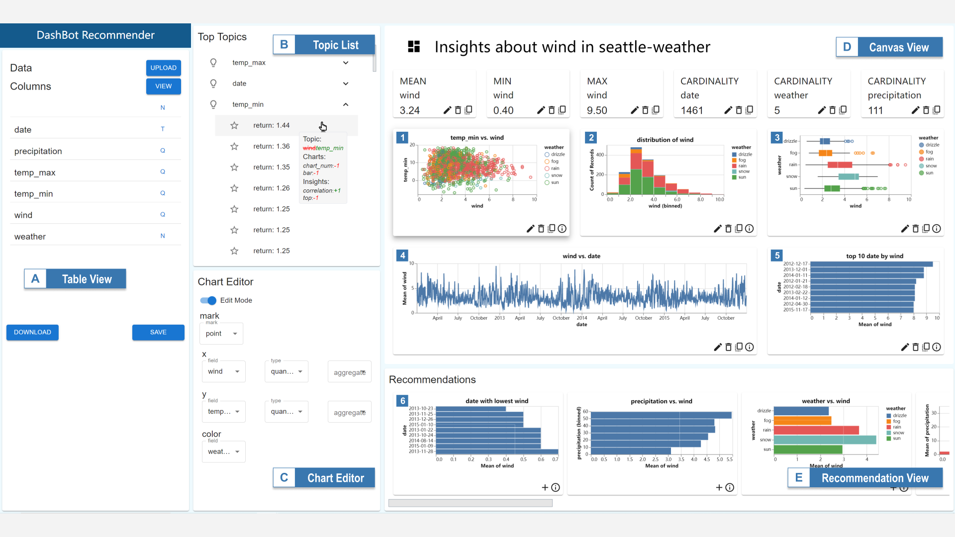
- Sketch of how to do DL dashboard design training (feature space + reward function based on insight function): Dashbot
- 3 taxonomies post survey framework for AI <> Viz intersections (evaluation, generation, NL, copiloting)
- Morning P2
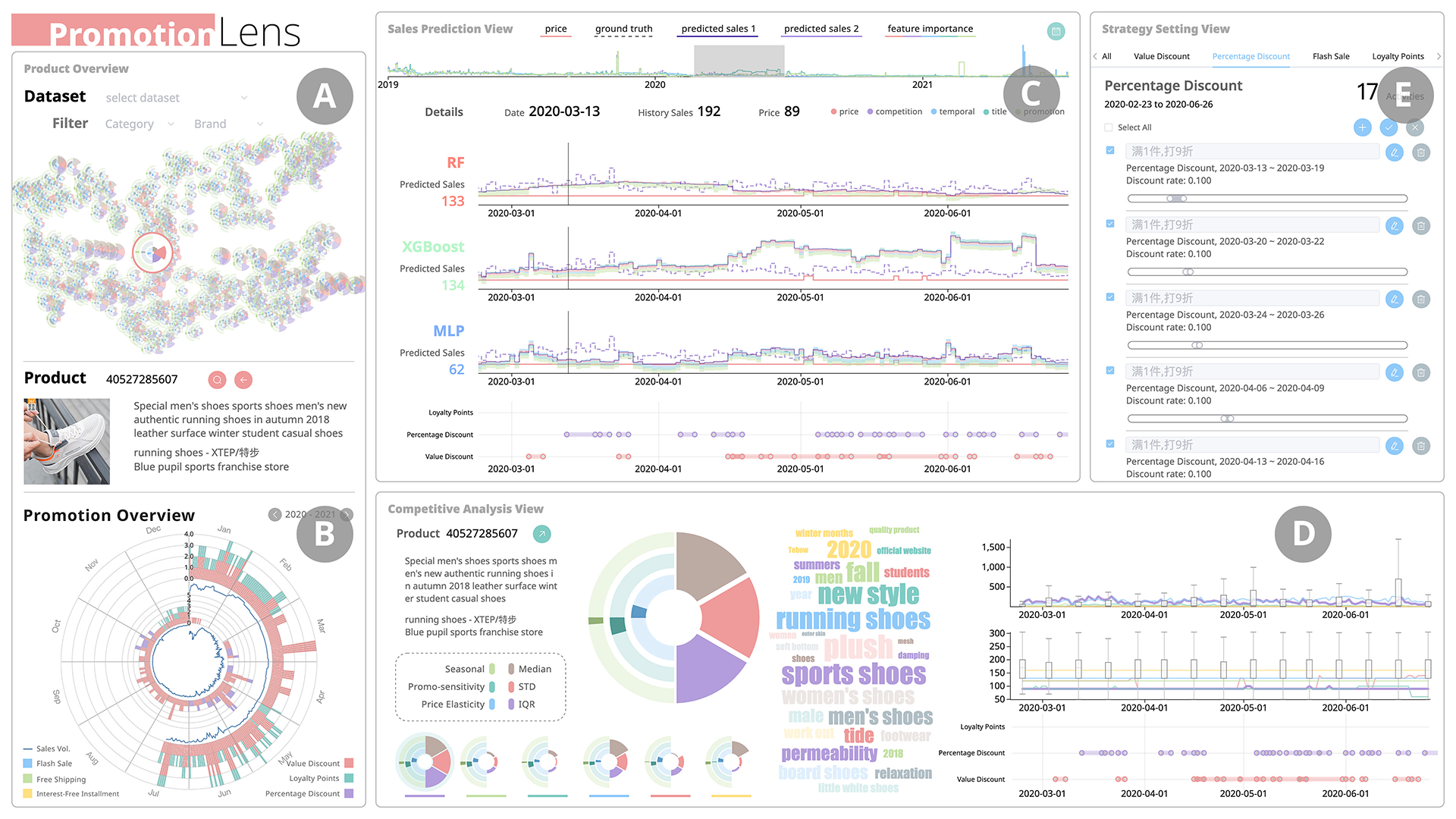
- Case studies: 2500 yrs of history, what-if analysis / SHAP plots for how online sales promos work
- Traveler: how would we use linked views on parallel traces? Link 2-layer Gantt with Topomap linked view
- contrails: TIL alpha-shape (generalized form of Sagar's Convex hull analysis (Edelsbrunner 1992))
- Privacy-preserving vis (motivates looking back into differential privacy + rebrushing on basics of bayesian networks)
- Afternoon P1
- BDFW: "tutorial" / gamelike experience for engaging someone in a vis
- Erato: DL can help with interactive storytelling / generating supporting captions + viz
- Roslingifier, Geostorylines main demos
- Afternoon P4: Guidance/Recommendations
- Visualize provenance: it can help someone not get lost during EDA. History or coverage.
- Provectories, Tradeoff (wheat) vis: summmarize log in embedding or with frequency vis
- RUM guidance: if someone is frustrated, can you nudge a "visual fix" / next step transform without getting to clippy stage?
- Medley: make recommendations based on INTENT (implicitly by other graphs, explicit by requesting certain compare types) - similar to storytelling sesion intent requests
- GeVitRec: DataRecon prioritize color and positional alignment using domain specific info, not just solo one off graphs. Compare to Showme, Draco, Voyager
- An observability specific recommender may outperform what a generic Draco alg does if we pick good heuristics
...what we demonstrate here is how a design space can be used to inject domain expertise into recommendation systems. We hope that our work makes headway on this “chicken and egg” problem, motivating further work on automating the construction of a VPDS by showing the practical benefits that can be obtained from having one available.
Raw Notes
ML for Vis
3 survey papers on intersection between #dataviz and #machine-learning (Private)
- AI4VIS: Survey on Artificial Intelligence Approaches for Data Visualization - Aoyu Wu
- https://arxiv.org/pdf/2102.01330.pdf

- Study counted dependencies (transformation, comparison, querying recommendation, etc)
- Browser for 98 papers: https://ai4vis.github.io/ (vue app)
- Include: DiagramFlyer: a search engine for data-driven visuals!
- Dataset: https://csrankings.org/#/index?all&us -> use to browse CS rankings!
- Upshot: Visualization data has domain knowledge coupled with visual artifacts -> This makes it harder to learn!
- DL4SciVis: A State-of-the-Art Survey on Deep Learning for Scientific Visualization
- https://arxiv.org/pdf/2204.06504.pdf
- Chaoli Wang (HK) - no paper browser after
- Surveyed multiple journals, Conferences, excludes all non-DL based ML
- Surveyed 59 papers! Partitioned by data type, + included tasks. Came up with a 6 dimensional taxonomy
- Prediction
- People go after CV because it's easy and popular... next wave is switch from datagen to vis gen!
- A Survey on ML4VIS: Applying Machine Learning Advances to Data Visualization (Qianwen Wang et al) #to-read
- https://arxiv.org/pdf/2012.00467.pdf (19 pages!)
- Covers 97 papers: https://ml4vis.github.io/
- Figure out gaps in VIS needs, strengths ML offers, and try to pair!
- Notice combos that are frequent , and what areas are avoided or poor pairings (e.g. semi supervised leraning, or regression in wrong tasks)
- QW on paper 1 vs 2
- them: concept of visualization as an important data type, including how these data exist and is studied by the researchers.
- us: shaping the needs/problems in visualization as ML task so that research can identify suitable visualization problems and employ proper ML techniques
- Stages: Data, vis (creating, insight, style), user (interaction user profiling, vis decoding). Good use of annotation!
Next ones focused on applications -> this region was a bit trickier to follow.
- Reinforcement Learning for Load-balanced Parallel Particle Tracing
- https://ieeevis.b-cdn.net/vis_2022/paper_images/v-tvcg-9706326.png
- Use reinforcement learning to efficiently split work for a supercomputer problem (16k processors). paritcle tracing used for 3d/atmosphere vis
- Agents communicate- share/staeal/split work, estimate costs to try and split work dynamically rather than needing to anticipate good worksplits in advance
- IDLat: An Importance-Driven Latent Generation Method for Scientific Data
- https://ieeevis.b-cdn.net/vis_2022/pdfs/v-full-1018.pdf
- Idea: when projecting high dim space down to latent space - can't weight data by "important" regions, regenerating latent space is hard
- Generate latent space in a way that takes "regions of interest" into account (unsupervised approaches). They contribute a way to use "Spatial importance maps" to take that input into account. used to help with understanding Hurricane Isabel dataset.
- DashBot: Insight-Driven Dashboard Generation Based on Deep Reinforcement Learning #to-read . Zhejiang uni sponsored

- https://ieeevis.b-cdn.net/vis_2022/pdfs/v-full-1033.pdf
- "agents" with reward fucntions for creating dashboards using domain-speciifc heuristics / reinforcement learning. Doesn't depend on large labeled corpus of datasets. use Markov Decision process.
- Use Tableau + powerBI training data to parametrize dashboard design
- Recommend diversity, insights, avoid diminishing returns
- Recommended followup charts. (Focuse on penguins / cars / IMDB datasets)
- People like the idea of rcommendation to "having key columns"
- Analytics group: https://zjuvag.org/ . Previous github: https://github.com/zjuidg
Digital Humanities, e-Commerce, and Engineering
Digital Humanities
- CohortVA: A Visual Analytic System for Interactive Exploration of Cohorts based on Historical Data #to-read
- https://ieeevis.b-cdn.net/vis_2022/pdfs/v-full-1426.pdf
- Had to span 2500 years of history - Yellow river changed course 6 times, date parsing with splits
- Lots of linked views, network matrix, great example of linked data browser
- To buy trust -> needed to establish cohorts of times/regions that reproduce existing theories to earn trust
- Visual analytics in digital humanities are quite text heavy (check the papers from last year on chinese history / career viz)
Commerce
- PromotionLens: Inspecting Promotion Strategies of Online E-commerce via Visual Analytics #to-read

- https://ieeevis.b-cdn.net/vis_2022/pdfs/v-full-1421.pdf
- https://virtual.ieeevis.org/year/2022/paper_v-full-1421.html
- Awesomely data dense -> latent space embedding to timeseries to pie chart to what-if analysis to testing odds of diff deals
- Unsure about costs of doing a radial view for cyclical data given that trends radius get skewed
- Supplement but not replace psych based theories for sales strategy
- W/ professor Quan Li: https://faculty.sist.shanghaitech.edu.cn/liquan/
Engineering (Physical, digital, Privacy
- Structure Borne Noise Analysis #to-read -> fancy demo of how industrial data displays play in mechanical Engineering
- https://ieeevis.b-cdn.net/vis_2022/paper_images/v-full-1547.png
- https://ieeevis.b-cdn.net/vis_2022/pdfs/v-full-1547.pdf
- https://virtual.ieeevis.org/year/2022/paper_v-full-1547.html
- Process -> "Campbell" plots used to find speeds and frequencies in simulation - highlight locations we not-passing combos
- Dataviz principles: "linked views' to correlate time, space, frequency/stress domains, "reference point" in corner to situate explorer
- Q&A: some discussion of helping people with breaking from the rainbow color map preference
- Traveler: Navigating Task Parallel Traces for Performance Analysis #to-read
- https://ieeevis.b-cdn.net/vis_2022/paper_images/v-full-1312.png
- https://github.com/hdc-arizona/traveler-integrated
- https://ieeevis.b-cdn.net/vis_2022/pdfs/v-full-1312.pdf
- How to navigate parallel traces / find bottlenecks
- Gantt chart alone is ok for serial stuff but breaks down for parallel traces.
- Single gantt suffers from multiple scale tasks (axis blown out by overall duration, miss local details)
- Q&A... people were using single tools, but had scaling problems. (SoA: Vampire, HPCViewer, Jumpshot)
- Visual Analysis and Detection of Contrails in Aircraft Engine Simulations #to-read (lightweight)
- https://ieeevis.b-cdn.net/vis_2022/pdfs/v-full-1617.pdf
- https://virtual.ieeevis.org/year/2022/paper_v-full-1617.html
- https://en.wikipedia.org/wiki/Alpha_shape
- Reduce impact on climate by modeling what leads to contrails forming from engines, and help people navigate the 100+ GB produced of data
- Invented a glyph to help summarize what happened
- DPVisCreator: Incorporating Pattern Constraints to Privacy-preserving Visualizations via Differential Privacy
- https://ieeevis.b-cdn.net/vis_2022/pdfs/v-full-1478.pdf
- https://virtual.ieeevis.org/year/2022/paper_v-full-1478.html
- Problem: If you publish a dataset you might denonymize points in it
- Data custodian needs to quietly anonymize data pieces without destroying insights- previous random sampling might cut out key insight
- Aside: d. boyd's keynote last year on how "private data, isn't (either)"
- Insight: tool to let someone iteratively generate charts with the desired properties while still injecting enough privacy to protect people
- Human in loop vs fully automated data scrubbing!
- Make use of a "privacy budget' that must be met, and use Bayesian network (topomap of bayes probabilities) to fulfill it
Storytelling
- Breaking the Fourth Wall of Data Stories through Interaction #to-read (Honorable mention!)
- https://ieeevis.b-cdn.net/vis_2022/pdfs/v-full-1198.pdf
- https://virtual.ieeevis.org/year/2022/paper_v-full-1198.html
- See preview: https://youtu.be/m1MwgbOWVxg: coded input/output grid framework (shows way to use matrix to parametrize design space!)
- #demo Corpus: https://idvxlab.com/btfwinteraction/
- Recipes for data stories (6 patterns
- Golden hook, kalidoscope, simulator, spotlight, touchstone (guess), magic mirror, spotlight (almost gamelike)
- Story phases: establisher, initial, peak, release
- Interactions that aim to create deeper link between readers and
- Based on survey of 58 existing data stories. (Quite a few items in here that may feed into Enjalot's keynote from Visxai on Monday: Monday - Day 2
- Erato: Cooperative Data Story Editing via Fact Interpolation (human-in-loop demo, is applied machine learning!)
- #demo https://erato.idvxlab.com/#/
- https://virtual.ieeevis.org/year/2022/paper_v-full-1495.html
- still unclear how this is possible, but amazing if it works
- Has good survey of #automatic-visualization techniques in background
- https://ieeevis.b-cdn.net/vis_2022/paper_images/v-full-1495.png
- Make data stories legible by user defining graph / captions
- AI filled in pictures + captions that interpolate
- Could this help with writing postmortems for viz that have access to full backend of data?
- https://ieeevis.b-cdn.net/vis_2022/pdfs/v-full-1495.pdf
- Built on past work with calliope #demo: https://datacalliope.com/#/homePage
- Uses deep learning algo (pretrained) to try interpolating between keyframe vectors!
- Probably small-dataset specific before it can do general purpose story authoring.
- 10-50 seconds latency
- Geo-Storylines: Integrating Maps into Storyline Visualizations
- Vanessa Peña-Araya
- https://virtual.ieeevis.org/year/2022/paper_v-full-1180.html
- https://ieeevis.b-cdn.net/vis_2022/pdfs/v-full-1180.pdf #to-read -> this might be cool for Gracie Xia
- OSF: https://osf.io/5wnyg
- https://gitlab.inria.fr/ilda/geo-storylines source code / https://geostorylines.herokuapp.com/ #demo
- Aligning time and space - reminded me of Devon Zuegel (Private)'s collab on Untitled Timeline Project (Private). Maybe try out linked micromaps Linked Micro Maps (Private)
- Compared 3 strategies: coordinate views, map glyphs, time glyphs.
- Coordinated views generally good, but time glyphs had some domain expert fans
- Sorted 100s of sketches from workshop before coding!
- evaluation: movement of politicians with 10 experts (peek into how to collab with experts)
- Q&A me... what options were dropped that you would add?
- Some of the workshop viz could be considered interpolations between the other two...
- Future: maybe spacetime cube for additional dimension!
- LOTR: 100+ people with 1000 locations is near the limit, stress test with Lotr dataset
- Code is there to try this with your own events (e.g. a trip journal vis!)
- Roslingifier: Semi-Automated Storytelling for Animated Scatterplots #to-read .
- https://ieeevis.b-cdn.net/vis_2022/paper_images/v-tvcg-9695173.png
- For now, not cue-based yet . Human in loop / in direction of #automatic-visualization
- Collab Niklas Elmqvist , Bum Chul Kwon
- Send this one to Jiyeon
- #demo https://github.com/shinminjeong/Roslingifier
- https://www.bckwon.com/pdf/roslingifier.pdf . Has demo video and website
- Human in loop approach extension to last year's data jam sessions: https://ieeexplore.ieee.org/abstract/document/9552192
- notice authors may think repetition was odd but readers tend to like it
- Explaining the axes is important: use
- Standout: annotated a few videos for techniques used, then try to automatically recommend significant moments in the graph to comment on
- Rise, drop,
- Trough/peak
- Plateau, spread, user defined target moment to zoom into!
- https://ieeevis.b-cdn.net/vis_2022/paper_images/v-tvcg-9695173.png
- Nanotilus: Generator of Immersive Guided-Tours in Crowded 3D Environments
- https://virtual.ieeevis.org/year/2022/paper_v-tvcg-9645360.html
- Presenter was first I had seen from KAUST
- VR strategy for explaining HIV or protein models in 3d.
- Camera is more immersive if you can go inside cell but it's crowded
- Developed an algo to carefully (and hierarchically) "sparsify" the region so that the camera isn't blocked
- Clear explnation with fruit tree, fruit, core at different levels of abstraction! Contrast with vis from other day (molecumentary) -> documentary generated by molecules
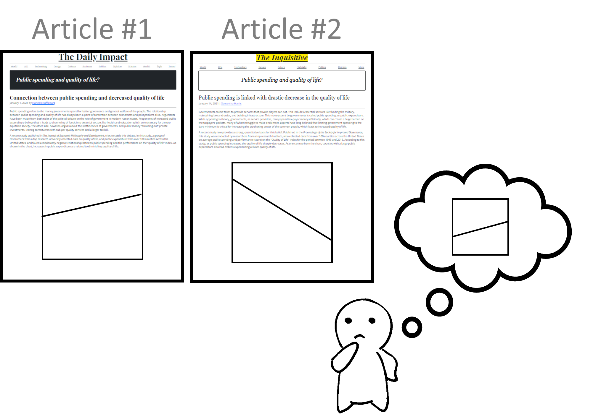
- How Do Viewers Synthesize Conflicting Information from Data Visualizations

- https://ieeevis.b-cdn.net/vis_2022/pdfs/v-full-1103.pdf
- User perception study (Prateek Mantri, supervised by Cindy Xiong) : new bar for friendly pacing/transitions etc
- #to-read
- Great #presentation (Private) storytelling style, annotations, etc, in robust study with 1000+ ppl
- Gist: what do people do if 2 credible sources have univariate lines going in opposite ways. Note whether people will dig in or reject conflicting info when facing with conflicting info
- Carefully isolated effects to find people tend to positive, moderate slope, avoid neg (corrective force stronger for neg than pos). Not able to do flat line levelin
- Funny... per Marti, in future next edition should include pure text version (in case people just like positive numbers)
- Perception lab influence spreading from Jessica Hullman / Northeastern core!
Provenance and Guidance
- The Influence of Visual Provenance Representations on Strategies in a Collaborative Hand-off Data Analysis Scenario
- https://virtual.ieeevis.org/year/2022/paper_v-full-1089.html Jeremy block #to-read
- https://ieeevis.b-cdn.net/vis_2022/paper_images/v-full-1089.png
- Investigate provenance, what does it mean to show people what others have done already when investigating (incident)
- Can you retrace their steps? Do you check missed areas, or check their work?
- usual ideas
- Show interaction history (states over time, interactive stories lineage graph)
- Coverage graph (what columns have been checked before)
- Used RUM-like data to see what behaviors (filtering, etc) are tested over time
- Reveal several browse strategies including: keyword, review origin, random acecss, or reject fully
- Upshot: choice of strategy wasn't triggered by showing coverage vs history.. maybe need more data, or learn that the tool isn't what controls what type of verification strategy someone uses.
- DD upshot
- Can we track provenance across multiple pages and present that data usefully
- Can we make better use of RUM 9 e.g. graph how much groupby/filtering happens over time in an expert session
- professionals might have better mnemonics (maybe OODA)... "success" at investigation is hard to define!
- Understanding How In-Visualization Provenance Can Support Trade-off Analysis (In agronomy/manufacturing). Has video demo
- https://virtual.ieeevis.org/year/2022/paper_v-tvcg-9768153.html
- https://github.com/tradeoff-analysis/provenance/raw/main/visprom.png
- https://github.com/tradeoff-analysis/provenance #to-read
- Longitudinal study (3 years) . if you give experts wheat data provenance data, do they use it?
- Decision making in groups: meet in group, form model, get the easy wins, then slowly hash out the long ones
- People struggle to keep track of decisions (no ADRs, reproduce old findings, get lost during exploration)
- Empirically found people were assisted by provenance data both DURING exploration and when resuming old ones
- Raw interaction log is useless, need to summarize a bit
- specific strategy
- MOre a cell is visited, more opaque it gets. Or see visits in corner
- Bar size shows how often this dimension was concerned. Keep track of wha selections generated some point.
- Visualize what range within global dimension that your chosen points fall under!
- Make it easy to take notes about what was good/bad about certain model combos (VisProm tool)
- Degree varied, but everyone use it at least a bit!
- See sample quotes: https://github.com/tradeoff-analysis/provenance/blob/main/visprom_selected_quotes.csv
- Low effort quotes could be valuable (detailed people name every photoshop layer...)
- Provectories: Embedding-based Analysis of Interaction Provenance Data #to-read
- Conny Walchshofer, Andreas Hinterreiter (presented)
- Provenance projection (provenance, projection, vector, trajectory, stories!)
- https://ieeevis.b-cdn.net/vis_2022/paper_images/v-tvcg-9652041.png
- Future of RUM: make provenance data less noisy, detect loops and whether a VA tool is supporting a cowpath or people are getting lost
- To read for
- Separte going based on TOPOLOGY (single user) or ATTRIBUTES BROWSED for multi-user
- To read for
- Has #demo https://provectories.caleydoapp.org/ / https://jku-vds-lab.at/publications/2020_preprint_provectories/
- Checkout more work from this lab.
- Embeddings come from: https://jku-vds-lab.at/pse/ : projection splace explorer
- Technique
- Used synthetic data to stress test projections, before pushing real data through. Can compare "swapping between different states" easily vs "verification loops".
- LOTSE A Practical Framework for Guidance in Visual Analytics #to-read
- #human-in-loop (Private) (Team with Menna)
- https://ieeevis.b-cdn.net/vis_2022/pdfs/v-full-1003.pdf
- #demo has vega: https://github.com/lotse-guidance/lotse-vega
- https://virtual.ieeevis.org/year/2022/paper_v-full-1003.html
- A YAML file of python hooks to run to recommend modifications to a user if they seem to be stuck
- We could perhaps use RUM frustration signal as an input to prompt an in-app remediation response
- User needs to be able to tell system about is preference / to reject bad suggestions. Also important to know when some suggestions might cancel each other out.
- Makes use of fastAPI to run independently!. (strategies, actions, and analysis states)
- SWE note- make sure all code is trusted before loading it this way. interesting to revisit this from APi design lens.
- Medley: Intent-based Recommendations to Support Dashboard Composition #to-read
- Video #demo: https://arjun010.github.io/individual-projects/medley.html
- https://ieeevis.b-cdn.net/vis_2022/paper_images/v-full-1142.png
- https://ieeevis.b-cdn.net/vis_2022/pdfs/v-full-1142.pdf
- Notion:
- intent is different if you are trying to build for self explore or pre-existing end-user
- Recommending single view is not as useful as multi view display
- Existing graphs on board may serve as signal of what is potentially useful
- Signal intent in 2 ways
- Explicit: (namely, measure analysis, change analysis, category analysis, or distribution analysis
- Implicit: selecting data attributes and views of interest
- Method: used powerbi + tableau as basis: public gallery recommended
- Collab with both Arjun and Vidya Setlur
- Q&A: this could apply to dynamic datasets, the statics things are standardized and don't need to be precomputed
- Upshot
- Extremely datadog relevant (level up powerpacks). Part of #human-in-loop (Private) and #automatic-visualization
- GEViTRec: Data Reconnaissance Through Recommendation Using a Domain-Specific Visualization Prevalence Design Space #to-read
- Video: https://www.youtube.com/watch?v=ko4ZBpBfFVk
- https://research.tableau.com/sites/default/files/Crisan_GenEpi_Recommender.pdf
- "data recon": helping people to get familiar with unfamiliar dataset
- @tamara.munzner (Private) and Anamaria Crisan, + rep from Gates founation for Ebola case study
- https://virtual.ieeevis.org/year/2022/paper_v-tvcg-9524484.html
- Looked to Nexstrain for inspiration
- Recommend MULTIPLE graphs to make them coherent (not just single plots)
- Align colors (consistent coloration project) and axes
- Not just tabular data, but also network + geospatial data!
- Method
- Also: good example of figurin gout how to work with experts to define domain space
- Can this be replicated for observability!
- Compare to DSL preferred by experts (R)
- SHow practical comparison vis existing #automatic-visualization options
- Used domain specific algo + chart templates to figure out how to align multiple graphs that would make sense to view together!
- Found the generated scores are closer to what MicroReact/Nextstrain do than the generic recommenders
- Findings
- Overall quite positive (fast and useful), participants wished the generated graphs were interactive and linked
- Q&A... we could add scores in UI. Recsplanation idea (spotify) may make sense in future to make the recommendations even more useful
To browse further later
- Narvis: narrative slideshow browser
- https://csrankings.org/#/index?all&us -> School rankings!
- DiagramFlyer:
- Indexed 300k images from 150k PDFs based on semantic properties of data graphs...
- https://web.eecs.umich.edu/~michjc/papers/shirley_wwwdemo.pdf
- Zhejiang Uni basketball vis: https://zjuidg.org/source/projects/OBTracker/OBTracker.pdf
- Qianwen visxai background: https://qianwen.info/
- Example: DNN genealogy: https://github.com/wangqianwen0418/DNN-Genealogy / demo:
- Network in a node: https://qianwen.info/demos/DNNGenealogy/
- Explore projection browser to make sense of high dim data sanely
- Peer of nextstrain: there's microreact!
- https://microreact.org/
- Nextstrain too: https://www.semanticscholar.org/paper/Nextstrain%3A-real-time-tracking-of-pathogen-Hadfield-Megill/bf6806dc1dfe057e907abfe786ee5037c4f7ea47
- Anamaria: pandemic vis on how nextstrain gets used: https://ajph.aphapublications.org/doi/10.2105/AJPH.2022.306857
Missed
- Carlolabe: document browser: https://virtual.ieeevis.org/year/2022/paper_v-cga-9238399.html
- Legalvis
- Text boundary visualization
- Temporal merge tree for big heatmaps
    - https://virtual.ieeevis.org/year/2022/paper_v-full-1051.html
- Prompt-maker IDE (Sent to Amelia Wattenberger)
Backlinks